MERK ARTS
Stories for higher
Design Directions · Round 1
Pick the look.
Three directions for the Merk Arts platform — same app, same content, same features, three different personalities. Each opens the real, working app: Home → Browse → Series → Player (with the X-Ray cast overlay on pause), the studio-forward catalog, and the revolver menu. Real licensed key art throughout. Tell us which feels like Merk Arts, and that direction becomes the production foundation.
Each opens in a new tab. Inside the app, click the revolver logo for the menu. Access stays unlocked on this browser.
★ Our recommendation
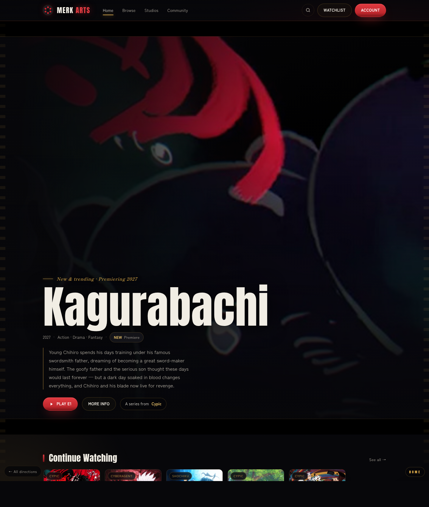
01 Cinema
The genre default, done right. Dark, immersive, poster-forward — exactly what anime fans expect from a premium streamer (Crunchyroll / Max / Netflix), so it reads as credible from day one. It also matches the dark, red-accented vision in your own pitch deck. The key art does the talking; lowest risk, highest instant familiarity.
Best if the priority is “feels like a real, serious streaming platform immediately.”
Explore this direction →
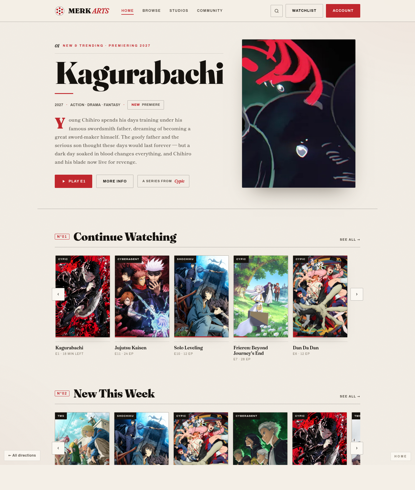
02 Studio / Editorial
Differentiate — anime as gallery art. Light, editorial, magazine-grade, with each licensor framed as a prestige imprint. Leans into the “champion the architect, nurture the narrative” mission. The boldest, most ownable, most memorable option.
Best if standing apart from Crunchyroll matters more than matching it.
Explore this direction →
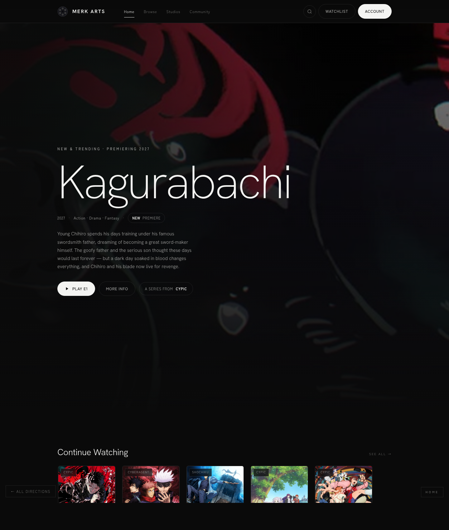
03 Minimal / Modern
Let the art breathe. Apple-TV+ restraint — black, white, one red accent, huge negative space. Understated, premium, and timeless; it never fights the key art and ages well.
Best if the brand wants quiet confidence and longevity over maximal energy.
Explore this direction →